New Transit Brand Brings Simplicity
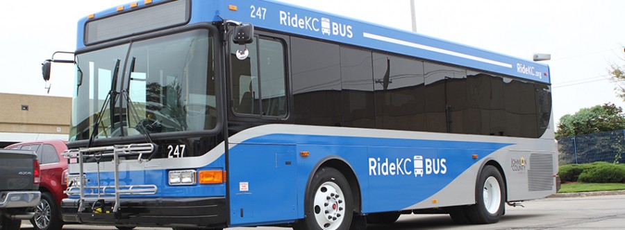
The new RideKC logo may seem overly simple at first glance, but the simplicity is its strength.
No one set out to brainstorm the next Nike swoosh, McDonald’s golden arches or Twitter’s little bird when the RideKC brand was developed during the last 18 months.
Increasingly visible as more buses roll out of the body shop, RideKC was always intended to be easy to understand because it brought together four transit agencies from across the Kansas City area.
“The more complex the transit system, the more basic the design had to be,” said Cindy Baker, chief communications officer for the Kansas City Area Transportation Authority.
There are more than a dozen different brands and logos used by transit agencies in Kansas City, Johnson County, Wyandotte County and Independence. There’s the Metro, the Jo, IndeBus, Special Edition, Main Street MAX, Troost MAX and others.
Baker and consultants from Willoughby Design wanted to develop something simple, something that could unite a fragmented system and create a seamless transit network that’s easy to use. RideKC turned out be the answer.
“More than fancy, we wanted a brand that would be easy for riders to follow,” Baker said. “We wanted a design that would easily lead riders to their transit option of choice, whether that’s the downtown streetcar, bus rapid transit service downtown or suburban service in Kansas or Missouri.”
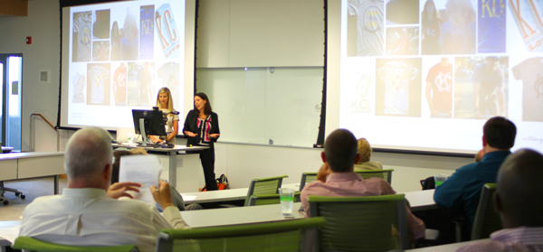
Consultants from Willoughby Design led community meetings about the rebranding process.
Willoughby’s research spanned the globe, examining transit logos and best practices in more than 50 cities in the United States and abroad. Transit brands were studied in Amsterdam, London, Paris, Australia, Chicago, New York and Los Angeles.
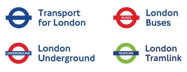
One brand that stood out and influenced the RideKC design was Transport for London and its logo, a simple circle crossed with a horizontal bar. The circle’s color starts with a basic blue, but changes depending on the type of transit, whether it’s a subway, a bus, rail or boat.
Transport for London is clear and concise even though it serves as a brand for 15 different modes of transportation. “Transport for London -- it’s where it goes and what it does. That really was an inspiration for RideKC,” said Megan Stephens, president and partner of Willoughby.
A key advantage of Transport for London that also plays in Kansas City is that it can easily be expanded to include other methods of transit without major changes.
For instance, the Transport for London logo generally remains the same throughout the system except for the color changes as the mode of transit changes.
Likewise, RideKC will cover many different transit services. The RideKC logo will remain the same whether it’s the new downtown streetcar, bus rapid transit routes, local bus service or paratransit service for riders with disabilities.
However, the color of the vehicle will change as the mode changes: blue for local bus service, white for the streetcar, red for bus rapid transit and green for paratransit. The different transit modes will be tied together with the same logo and a silver streak across the vehicle. The RideKC name will remain.
The design is comparable to Los Angeles where the colors orange, pink, yellow and silver designate different mode of transits with the same Metro name.
“Our No. 1 purpose is for people to be able to use the system and figure out what vehicle they need to get on and figure out where they’re going,” Stephens said.
RideKC always had to be simple so that it would stand the test of time, Stephens said.
“We’re designing something that needs to live for a long time,” she said. “When you get too tricky or you start adding too many design elements, it doesn’t have longevity anymore.”
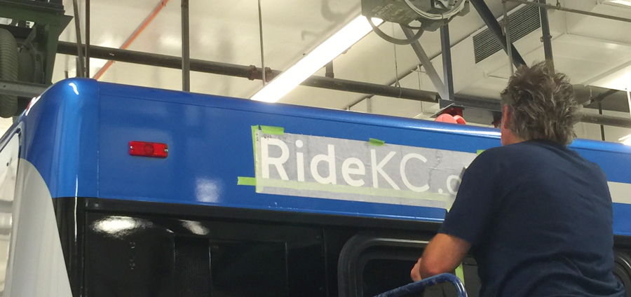
Decals are carefully applied to one of the first RideKC buses this fall.
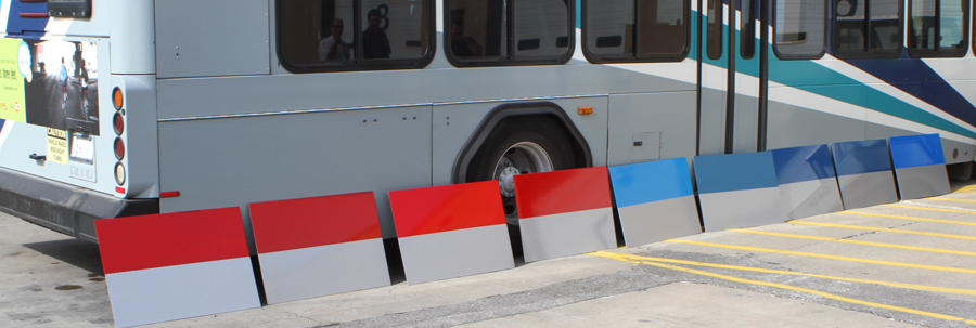
Making design choices for the buses included creating giant paint chips that were viewed under various light conditions.