New transit system map reflects national trend
No one should need to be a code breaker to understand a transit map.
It’s why the KCATA developed a new transit system map that for the first time gives riders an idea of how frequently our routes operate across the region.
The new map sets routes apart based on how frequently they run, similar to how a highway map distinguishes between different types of roads.
The goal is to give our customers useful information about the routes so they can answer the age-old question about transit: How long do I have to wait?
Frequency mapping is an emerging national trend seen in cities such as Minneapolis, Portland and San Francisco where route lines on the map vary in thickness based on how often buses run.
The idea is to design the maps in such a way that riders know which services are best suited for their transportation needs.
The case for these type of maps has been made by Jarrett Walker, a national transit planning consultant.
He argued in a 2010 blog post that transit maps portraying each route equally would be trantamount to highway maps where drivers couldn’t differentiate between interstates and rural roads.
“What do we achieve by putting all of these lines on the same map and making them look the same,” Walker wrote. “The most powerful message seems to be: These are all buses and all bus services are alike.”
Identifying route frequency, Walker said, helps remove complexity from transit by not only telling riders where the service is but when it's available as well.
The KCATA’s old map was made up of various solid colored lines with numbers showing each route. Each line is the same width, giving no indication of frequency.
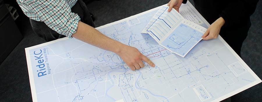
The new map, available at the RideKC website, has lines in varying widths to show the differences in frequency.
Dark blue lines, for instance, mean regular bus service running at 30 to 60 minute intervals. A lighter and thicker blue line shows service running at 12 to 15 minute intervals.
It is an update from one done more than five years ago. Our new map, with the RideKC color scheme and typeface, shows transit options across the region. Riders can locate routes in Johnson County, Wyandotte County, Independence as well as the streetcar.
The new map provides a broad overview of our system. RideKC keeps more detailed maps and schedules – in print and online – for specific routes across the region.
Planners and graphic designers will revise the map over the next few months to include service changes planned for the coming months.
Eventually, it’s our goal to create system maps tailored for specific parts of the Kansas City region highlighting the routes most used in those areas.
“The new system map allows current and prospective riders to see the full extent of the regional transit network as well as the type of service provided by each route,” said KCATA Planner Shawn Strate.
“We believe that this map will enhance the understanding of transit service throughout the region and be a valuable tool for riders, visitors, and the community at large.”